Web Components

professional div renderer
Do you know that you can create your own components without using any front-end library or frameworks like React and Vue? And what's more interesting is that you don't need anything other than plain HTML, CSS, and JavaScript. These custom components are known as Web Components a.k.a Custom Elements.
The basic idea is to bind together the logic (JavaScript), styles (CSS), and structure (HTML) to create an element that can be used multiple times without the need to copy and paste the same code again and again. This leads to more cleaner, maintainable and modular code.
Since web components aren't built using any third-party library but on the core web principles, developers don't need to worry about implementation details like how a certain framework handles the same thing in a different way than other and the code wouldn't become obsolete.
Furthermore, you can use them in your React, Vue, or Angular apps just like a normal component with other framework components. The same web component can be used in any framework without changing anything. So it's up to you, you can also use some Web components and some framework depended components.
There are mainly three technologies that are used to create Web Components.
- Custom Elements ~ Allows you to define a custom element, which informs the parser how to properly construct an element (like
<my-tag>) and how they react to changes. - Shadow DOM ~ (No, it's not Virtual DOM) Shadow DOM encapsulates the markup, styles, and functionality and keeps them separate from the rest of the code to avoid code clashes and keep the code modular.
- HTML Templates ~ Holds fragments of HTML that aren't rendered until called upon by a script.
Let's create our first Web Component
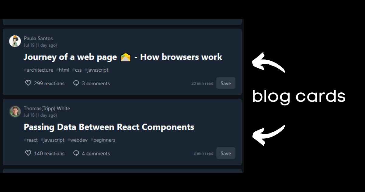
We will be creating a Blog card component. A blog card contains useful information about a blogpost like a title, description of the article, like and comments received, name and image of the author, and so on. Now you can imagine how useful it would be to have a component for that otherwise we would have to copy and paste the same markup with different data.
This is how a blog card looks like on dev.to
Step 1. Create a template
To create a template of all of the blog card structures, we will use the template element. The element and its contents won't appear on the page until you use a reference with javascript and then append it to the DOM.
const template = document.createElement('template');

template.innerHTML = `
<style>

</style>
<div class="card">

</div>
`;
Inside the style tag will go all of our CSS for the custom element and inside the div with a class of card will go all the structure of our blog card. We will leave them like that for now.
Step 2. Create a JavaScript Class
We define the definition of our custom element into a javascript class and then extend it from HTMLElement which helps to implement custom HTML elements.
Remember to use super() inside constructor so that we can have access to various class methods of the parent class.
export class Blogcard extends HTMLElement {
  constructor() {
    super();
    //...
  }
}
Step 3. Create a hidden DOM for the component
Create an encapsulated hidden sub-DOM tree for the component using Shadow DOM. Shadow DOM tree starts with a shadow root which can be attached to any element we want in the same way as DOM. Below is an image is taken from MDN showing a high-level view of that.
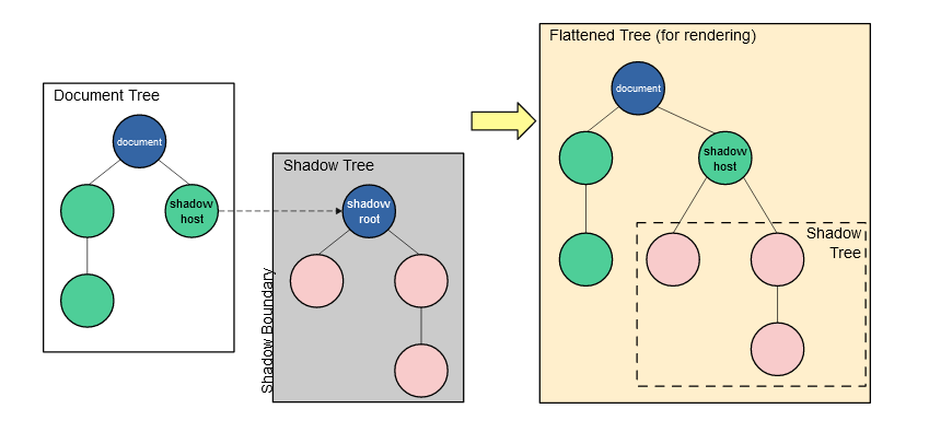
To attach a shadow root to an element, you can call the attachShadow() method on that element which takes an object as its parameter containing one option mode, with a value of open or closed.
With open mode, the hidden DOM can be accessed by the outside javascript while with mode closed, you won't be able to access shadow DOM from outside (but not really, you can learn more about the modes from this article by Leon)
After that, we can add child elements to the shadow DOM using regular DOM methods.
//inside the class 'Blogcard' after super();

//attaches shadow root to 'this' with mode open making it accessible to outside world
this._shadowRoot = this.attachShadow({ mode: 'open' });

//appends a clone of template to shadow DOM
this._shadowRoot.appendChild(template.content.cloneNode(true));
Step 4. Register the component
We want to have our own <blog-card></blog-card> HTML tag, but HTML doesn't know anything about our custom element right? So we define that by calling define() method on customElements on the global window object.
The first parameter is the name of the new custom element, in our case, it is blog-card. Note that this name must contain a hyphen.
The second parameter is the constructor for the new element. It is Blogcard in this case.
There is also a third parameter known as options which is optional, but we don't need to know that as of now.
window.customElements.define('blog-card', Blogcard);
These are all the steps required to create our custom element. Now we can start using our blog-card HTML tag. Still, right now we have only created a basic template, there is nothing inside the element itself.
<blog-card></blog-card>
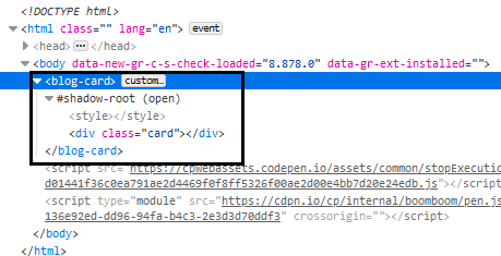
On inspecting the element you will see something like this, you might need to toggle the shadow root:
Now, let's add some content and styles for the div with a class of card. I'm going to hard code the data inside the div but you most probably wouldn't. For that, you can create your own methods inside the class to fetch the data and displaying it.
template.innerHTML = `
<style>
    .card {
      background: black;
      color: white;
      padding: 1rem;
      margin: .5rem 0;
      font-family: arial;
    }
    .card-title {
      font-size: 1.5rem;
      font-weight: 600;
    }
    .card-date,
    .card-brief {
      color: #eee;
    }
</style>
<div class="card">
    <div class="card-title">Blog Title</div>
    <p class="card-date">June 06, 2021</p>
    <p class="card-brief">I describe this blog but briefly!!!</p>
</div>
`;
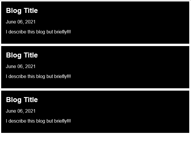
And now you can use the same blog-card tag multiple times whenever you want 🤯. Again I hard-coded the data just so that we can focus entirely on building the web component itself.
<blog-card></blog-card>
<blog-card></blog-card>
<blog-card></blog-card>
Output on the browser:
You can grab the whole code for this article, here on my codepen
This is definitely not the end. We have barely scratched the surface of web components in this article. This article was meant to only give an introduction to web components.
Web components have been growing in adaption rapidly because they offer the power to encapsulate the code without relying on any framework. In the past few days, I've spent most of my time learning and experimenting with web components. I've even built my first NPM package 🥳 called hashnode-postcard. I believe every web developer should know about web components as they are truly shaping the future of the web as a component-based system.
Explore further 🌌
- MDN docs on Web Components, Shadow DOM, Templates
- HTML standard on Introduction to Custom Elements, Template element
- Web Components Tutorial


