

Recently I cloned the UI of Netflix's Landing Page using just React and Sass to practice CSS. Though it was simple, there were a lot of learning opportunities for someone like me to play with frontend development, and I quite enjoyed that challenge. Here's the link to the project if you are interested : Netflix Landing Page Clone.
In this post, we will be focusing on a section that you might have already seen on many other online platforms and learn how to implement that. It is called accordion, not the piano one thought 😂.
What is a web accordion?
It helps you manage collapsable content. They are useful when you want to toggle between hiding and showing a large amount of content.
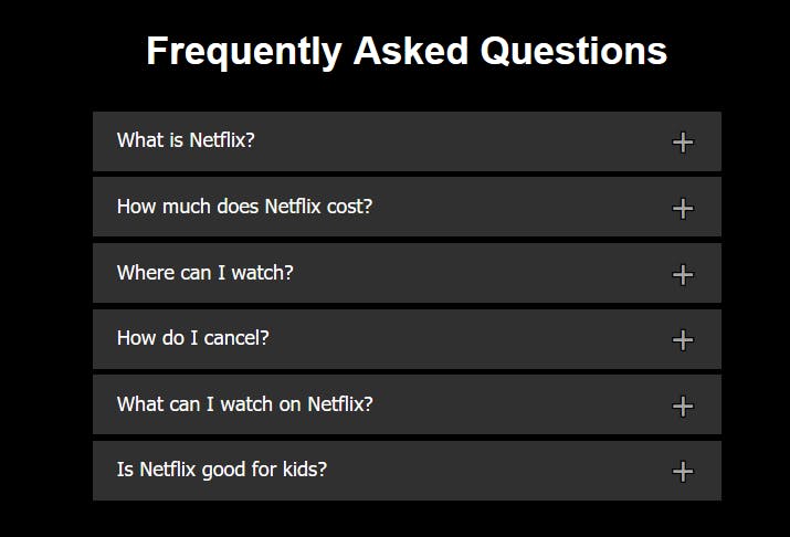
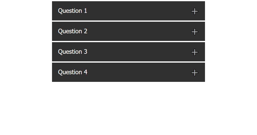
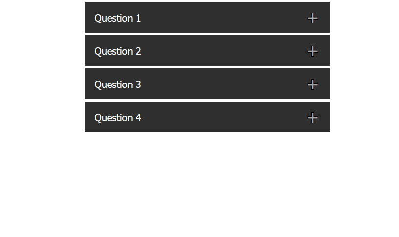
This is what I built for the clone project:
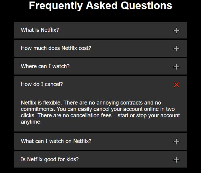
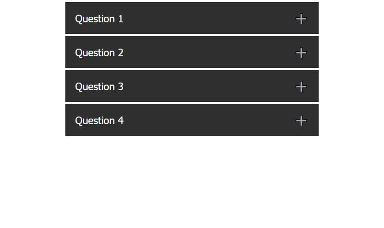
If you click on one of the blocks, it would expand the content and look like this:
Let's get building 🔨
Note: For the sake of simplicity, I will use plain HTML, CSS, and Javascript to build this instead of React and Sass.
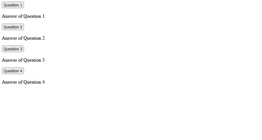
✏ First, let's create the structure of the accordion with HTML:
<div class="qna">
  <button class="accordion">Question 1</button>
  <div class="panel panel-closed">
    <p>Answer of Question 1</p>
  </div>
  <button class="accordion">Question 2</button>
  <div class="panel panel-closed">
    <p>Answer of Question 2</p>
  </div>
  <button class="accordion">Question 3</button>
  <div class="panel panel-closed">
    <p>Answer of Question 3</p>
  </div>
  <button class="accordion">Question 4</button>
  <div class="panel panel-closed">
    <p>Answer of Question 4</p>
  </div>
</div>
🎨 Now, we will add some basic styles and reset defaults with CSS:
/* Centers horizontally */
.qna{
  max-width: 500px;
  margin: 0 auto;
}
/* Button default resets */
button{
  border: none;
  outline: none;
  cursor: pointer;
}
/* Styling the accordion buttons */
.accordion{
  width: 100%;
  background-color: #303030;
  color: #fff;
  font-size: 20px;
  padding: 18px 20px;
  margin-bottom: 1px;
  text-align: left;
  /*  To push the plus sign to the right  */
  display: flex;
  justify-content: space-between;
  align-items: center;
}
/* adding the "plus" sign (+) */
.accordion::after{
  content: '\02795';
  font-size: 20px;
  color: #fff;
}

.panel{
  background-color: #303030;
  color: #fff;
  margin-bottom: 4px;
  overflow: hidden;
}
.panel > p {
  font-size: 20px;
  padding: 10px 20px;
}
.panel-closed{
  max-height: 0;
  overflow: hidden;
}
⚙ Adding Functionality with Javascript
We should roughly note down what we want. When someone clicks on the accordion button, we would want to:
- show the panel below the accordion (with sliding down animation)
- change the "plus sign (+)" to something else, like a "cross sign (x)"
- auto close the previous panel if another button is clicked
Let's code that down, one by one:
Here, we can add a class panel-open and remove the panel-closed class on the panel div when someone clicks the accordion button and similarly do the opposite when the button is clicked again. We already have the closed class, let's write the open class:
.panel-open{
  max-height: 700px;
}
Coding the class add and remove logic in javascript:
let accordion = document.getElementsByClassName("accordion");
const totalAccordions = accordion.length;

for (let i = 0; i < totalAccordions; i++) {
  accordion[i].addEventListener("click", (e) => {
    let panel = e.target.nextElementSibling;

    if (panel.classList[1] === "panel-closed") {
      panel.classList.add("panel-open");
      panel.classList.remove("panel-closed");
    } else {
      panel.classList.add("panel-closed");
      panel.classList.remove("panel-open");
    }
  });
}
This would toggle max-height property based on the click event on the accordion button.
Now, to change the plus sign to a cross sign, we can add another class to the accordion button on active state and javascript would handle that on the same click event handler function:
/* active class for accordion, adds the "cross sign (x)" */
.accordion-active::after {
  content: "\274C";
}
After adding the js code:
let accordion = document.getElementsByClassName("accordion");
const totalAccordions = accordion.length;

for (let i = 0; i < totalAccordions; i++) {
  accordion[i].addEventListener("click", (e) => {

  // toggle the class 'accordion-active' on accordion button
  e.target.classList.toggle("accordion-active");

    let panel = e.target.nextElementSibling;

    if (panel.classList[1] === "panel-closed") {
      panel.classList.add("panel-open");
      panel.classList.remove("panel-closed");
    } else {
      panel.classList.add("panel-closed");
      panel.classList.remove("panel-open");
    }
  });
}
A more Clean way of doing that would be to use toggle instead to add and remove:
let accordion = document.getElementsByClassName("accordion");
const totalAccordions = accordion.length;

for (let i = 0; i < totalAccordions; i++) {
  accordion[i].addEventListener("click", (e) => {

  // toggle the class 'accordion-active' on accordion button
  e.target.classList.toggle("accordion-active");

    let panel = e.target.nextElementSibling;

    if (panel.classList[1] === "panel-closed") {
      panel.classList.toggle("panel-open");
    }
  });
}
🌈 Adding smooth slide down animation:
To make the sliding of the panel look smooth, we can also add a transition property that would look for the max-height, all we have to do is to add that on the panel class.
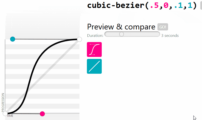
.panel{
  transition: max-height .33s cubic-bezier(.5,0,.1,1);
}
Here's a nice visual comparison between the above cubic-bezier curve and a linear transition.
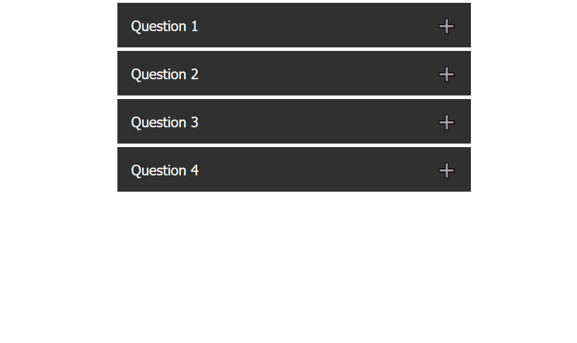
This is how it looks like after adding the transition property:
We are almost done, but something is missing. Yep, the previous panel doesn't auto-close on opening a new panel.
Let's create a function for that, this function would take in the currently open panel as an argument and close all the other open panels (if any) on opening another accordion.
const closeAllExcept = (pan) => {
  for (let i = 0; i < totalAccordions; i++) {
    let panelToClose = accordion[i].nextElementSibling;
    if(panelToClose !== pan){
       accordion[i].classList.remove("accordion-active");
       panelToClose.classList.remove("panel-open");
    }
  }
}
We now need to invoke this function. Below is the final javascript code, you would also notice that I had moved the accordion-active class toggle code inside the if block because now closeAllExcept also has the control to toggle the class.
let accordion = document.getElementsByClassName("accordion");
const totalAccordions = accordion.length;

for (let i = 0; i < totalAccordions; i++) {
  accordion[i].addEventListener("click", (e) => {
    let panel = e.target.nextElementSibling;

    if (panel.classList[1] === "panel-closed") {
      e.target.classList.toggle("accordion-active");
      panel.classList.toggle("panel-open");
      closeAllExcept(panel);
    }
  });
}

const closeAllExcept = (pan) => {
  for (let i = 0; i < totalAccordions; i++) {
    let panelToClose = accordion[i].nextElementSibling;
    if(panelToClose !== pan){
       accordion[i].classList.remove("accordion-active");
       panelToClose.classList.remove("panel-open");
    }
  }
}
Hooray, it's working perfectly now 😍
It was fun building this, isn't it? 😎 If you want to play and mess around, here's a link to my Codepen for this project. If you enjoyed reading this, let me know in the comments or reach out to me on Twitter @AyushCodes 🙌